Exhibitions of the Year 2010

Somehow, I couldn't quite seem to restrict myself to a mere 'top five' exhibitions of the year this time round, so here's my (somewhat unconventional) 'top six' favourite exhibitions of 2010:

6. Exhibition #3 at the Museum of Everything.

Whilst the latest offering may not have been quite as challenging as their first exhibition, which I saw in 2009, visting the Museum of Everything is always a delightful experience. Co-curated by Sir Peter Blake, this enjoyable exhibition was a glorious riot through English eccentricity, from Punch and Judy puppets to seaside souveniers to taxidermied kittens: a friendly breath of fresh air in comparison to the slick minimalism of so many galleries and arts venues.


5. Alice Neel: Painted Truths at the Whitechapel

I wasn't very familiar with Alice Neel's work until I went to see this impressive and very comprehensive exhibition at the Whitechapel Art Gallery earlier this year. Focusing predominantly on Neel's portraiture, this sensitive exhibition brought together a blunt, unflinching and very powerful body of work.


4. Touched: Liverpool Biennial 2010

OK, so maybe I'm cheating slightly with this one, since Touched is really a whole programme of exhibitions rather than just one. Though no single artwork or venue especially stood out for me, the power of this year's Liverpool Biennial was its overall energy and dynamism, as well as the sheer range and diversity of work to discover in unexpected places all over the city. My highlights were Laura Belém's The Temple of a Thousand Bells (pictured), Tehching Hsieh at FACT,  Nicholas Hlobo at Bluecoat, and Ryan Trecartin's frankly bizarre Trill-Ology.


3. Chris Ofili at Tate Britain

I wasn't totally sure whether I really liked Chris Ofili's work until I saw this mesmerising retrospective exhibition at Tate Britain early in 2010. Powerful and compelling, this exuberant, joyous explosion of vibrant colour and texture was also incredibly well thought-out: a great example of what Tate do best.


From Here To Ear - Céleste Boursier-Mougenot

2. Céleste Boursier-Mougenot at the Barbican

For sheer enjoyment, this charming commission for the Barbican's Curve Gallery wins hands down. French artist Celeste Boursier-Mougenot transformed the space into a magical and uplifting soundscape, starring a flock of zebra finches. Frankly, contemporary art doesn't get much better than watching a zebra finch take a bath in a cymbal.


1. Diaghilev and the Golden Age of the Ballet Russes at the V&A

Narrowly squeezing in at the very end of the year, this entralling and highly atmospheric exhibition at the V&A was one of my highlights of the year. Blending visual materials with a whole range of fascinating background information about the choreography, music and design of Diaghilev's groundbreaking productions, this was a beautifully curated exhibition: rich, evocative, and full of bohemian splendour.


Read my top five exhibitions from 2009 

Merry Christmas!


Just a quick post to wish everyone a very Merry Christmas. See you in 2011!

[Image via Tumblr]

Diaghilev and the Golden Age of the Ballets Russes 1909-1929


I had been looking forward to the V&A's major autumn exhibition, Diaghilev and the Golden Age of the Ballets Russes 1909-1929 for a while, so I was especially pleased to be invited to go along and see it, as well as to hear a talk about Diaghilev by fragrance specialist Roja Dove, who created a new fragrance especially for the exhibition.

This beautifully-curated show tells the story of  Diaghilev's Ballet Russes, focusing particularly on how he blended dance, music and modern art in his productions to create avant-garde works of 'total theatre', collaborating with some of the most radical artists of his day, such as Stravinsky, Chanel, Picasso, Matisse and of course, the company’s famous choreographer and dancer, Nijinsky. Moving from the dazzling launch of the Ballet Russes in 1909, through the events of the Russian Revolution and the First World War, and into the 1920s, the exhibition also examines the huge influence Diaghilev exerted on 20th century culture, especially in art, design, fashion and theatre, as well as his legacy in terms of contemporary dance.


Exuberant, glamorous and opulent , this exhibition is hugely enjoyable - a carefully-assembled treasure trove of Diaghilev's personal effects and documents, as well as short films, an incredible selection of original costumes, and fascinating visual material such as posters, photographs and backcloths.  Further material relates to the choreography, music and design of Diaghilev's productions, from scores and dance patterns through to set models and costume design sketches, which illustrate the strongly radical and often controversial nature of these archetypally modernist productions.


Walking through this exhibition is a genuinely atmospheric experience: strolling through dramatically lit spaces with a striking red and black colour scheme, we move first through a darkened 'backstage' area and then emerge into a 'stage' complete with backcloth, music and brilliant lighting - for a moment, we too are allowed to take our place in the spotlight. Nonetheless it is the charismatic figure of Diaghilev himself who remains very much centre stage in this enthralling exhibition, as in Roja Dove’s entertaining talk about the man and his influence on the world of fragrances in particular, as well as art and culture more broadly.  

Though I have to admit that I'm particularly intrigued by the world of ballet, and have a special interest in this period, regardless of whether or not you're a balletomane, this exhibition is a fascinating feast to enjoy - rich, evocative and full of bohemian splendour.

The exhibition runs until 9 January and there's also a blog by the exhibition's co-curator, Jane Pritchard, on the V&A website.


[All images via the V&A]

The Museum of Everything: Exhibition #3


Following my visit to the fantastic Museum of Everything last year, I had been eagerly anticipating going back to check out the latest show at their Primrose Hill venue - and when I went along last weekend, I certainly wasn't disappointed. The simply-titled Exhibition #3 is a charming celebration of the British folk tradition with all the nostalgic, whimsical and slightly discomfiting appeal of an old-fashioned fun fair ride.

Co-curated by Sir Peter Blake, most of the works that make up this cornocopia of artefacts and artworks come from his own personal collection, in a show that according to Blake himself is 'about wanting to share everything'. Amongst the works on display is a recreation of Walter Potter's Museum of Curiosities, featuring a selection of weird and wonderful dioramas peopled by taxidermied squirrels, kittens and birds. Gaudy music hall and vaudeville memorabilia, Punch and Judy puppets, photographs of Victorian circus performers and kooky seaside souvenirs also have their place in this multicoloured assemblage, which like the previous exhibitions I've seen by the Museum of Everything, offers an utterly refreshing alternative to the slick sophistication of the 'white cube' gallery. The exhibition is accompanied by a lively events programme: the day I visited there was a live taxidermy demonstration (though I was frankly too squeamish to watch it) as well as hula-hooping, accordian music and a host of other quirky performances.

Although this show is similar in both feel and approach to the Museum of Everything's previous exhibition - a fascinating survey of outsider art - at heart, Exhibition #3 is quite a different project, taking its lead from one of Britain's best known and most established artists. But though the exhibition itself is arguably rather less ambitious, what I still love about the Museum of Everything is its distinctive atmosphere - visiting is quite simply an enormously enjoyable experience.

Exhibition #3 closes on 24 December, but I'm sure we haven't seen the last of the Museum of Everything. And I for one, am eagerly anticipating whatever they do next.

[Handpainted Punch and Judy puppets c. 1920 via the Museum of Everything - photo: Christoffer Rudquist.]

Drink, Shop & Do


I've just discovered Drink, Shop & Do - a fabulous shop and cafe bar that's a complete breath of fresh air in the otherwise pretty uninspiring Kings Cross area.

Located in a light and airy Victorian former bath house, it serves up a small but perfectly formed menu featuring dainty triangle sandwiches, delicious cakes, quirky cocktails, wine and of course, tea in pretty teapots. The decor is a charming mishmash of kitsch vintage furniture and patchwork quilts, and everything is for sale, from the cake stands and china ornaments right through to tables, chairs and sofas. As a bonus, there are board games to play, the music is great and it's open until 11.30pm. What's more, there are lots of different events on offer, including knitting night, scrabble afternoon, and the evening we were there, truffle rolling!

We had a lovely time on our visit: in fact, I have to admit that cake + wine + tea + board games + crafts = pretty much the perfect evening for me and my friends.  I think it's safe to say that we'll definitely be back!

The Monster Supply Store


You'll have been hard pushed to miss the recent press coverage of the Ministry of Stories, a newly-launched volunteer-run initiative aimed at reawakening children's imaginations and getting them writing creatively. Supported by authors including Nick Hornby (one of the founders), Zadie Smith and Roddy Doyle, the London-based project is inspired by the hugely successful 826 Valencia, a children's writing centre set up by Dave Eggers in San Francisco.

The Ministry aims to provide a free space for fresh writing by young people, including workshops and one-to-one mentoring. The services are all provided by volunteers, including local writers, artists and teachers, who give their time and talent for free. And at the front of the workshop spaces is a rather unique shop - Hoxton Street Monster Supplies. It's only been open for a week or two, but anyone is welcome to pop in and purchase anything that the average monster might need - from a tin of Escalating Panic to a packet of Fang Floss.

I went to take a peep at the shop last weekend, and if you're in London, I highly recommend paying it a visit. It's enormous fun and incredibly well-thought out: all the staff stay perfectly in role, and there are lots of lovely little touches, from a shelf with a huge bite taken out of it, to a handy noticeboard for monster small ads (e.g. 'Missing: One Brain...').

As well as tins of Mortal Terror (the tins, by the way, contain short stories by the likes of Joe Dunthorne and Laura Dockrill) you can buy monster artworks created by illustrators who teamed up with local primary schools, and t-shirts printed with a slogan of what else but 'Boo!'

My personal highlight is the 'invisible cat' that purrs on your approach. "Oh don't mind her," said one of the assistants as I stopped, intrigued, to take a closer look. "She's such an attention seeker."


Find out more about the Ministry of Stories and the Monster Supply Store here.

[Images via Ministry of Stories]

We Make London Christmas Craft Show: Part II

Following last week's ticket giveaway for the We Make London Christmas Craft Wonderland, on Saturday I popped over to Chelsea Town Hall to take a look at the fair myself.

It was a suitably festive occasion, complete with carols, fancy dress and tasty Christmas treats in the cafe. Stalls displayed a wide range of work from over 80 designer/makers, including jewellery, homewares, ceramics, clothing and limited edition prints, largely at very affordable prices: great for finding unusual Christmas gifts, not to mention a little crafty inspiration.

Whilst we were there, we also joined in with a fun Christmas decoration workshop, led by Aimee Waller of Chateau Velvet. Aimee showed us how to make some paper Christmas decorations - as well as feeding us with Quality Street - thanks Aimee!

Here's a few things that caught my eye at the fair:


I hope that all those who entered the giveaway for free tickets enjoyed their visit to the fair...

Knit your own ruby slippers


Look what I made! My very own hand-knitted ruby slippers - perfect for keeping toes toasty warm on these chilly winter afternoons.

As an early Christmas gift to readers of a crafty bent, I thought I'd share the pattern I used to make these. It's so easy and quick, and ideal if you're a beginner when it comes to knitting. You can make it with any DK weight wool you have to hand, although I have to admit that I quite like the idea of making some with sparkly red yarn for the full-on Wizard of Oz look.

The basic pattern for the slippers is based on paperandglue's ridiculously easy mary jane slippers, which you can also find on ravelry here. Here goes:

Follow the Yellow Brick Road Ruby Slippers

You will need:

Any red DK yarn.
4.5mm needles.

To make the slippers:

Cast on 30 stitches.
Knit for 18cm in garter stitch. Bear in mind that you may need to increase or decrease the length here depending on the size of your foot - I wear UK size 4/5 shoes.
K2tog for two rows, keeping in pattern.
Cut off the yarn, leaving a long tail which you can then thread through the remaining stitches like a drawstring.
Using the tail of yarn, sew the two edges together for about 7cm to make the toe of your slipper.
Sew up the vertical seam at the back to make the heel of the slipper.

To make the bows:

For the main bow:
Cast on 7 stitches.
Knit for 8cm in garter stitch.
BO in pattern.

For the loop:
Cast on 3 stitches.
Knit 4cm in garter stitch.
BO in pattern.
(alternatively if you prefer, you could make a 4cm piece of icord instead)

To complete the bow, wrap the loop piece around the centre of the main bow, and stitch it together on the back side. You can then stitch the finished bow to the toe of your slipper.

To finish:

Tap heels together three times...

We Make London Christmas Craft Show (plus free tickets for readers!)


It's that time of year again... Christmas is fast approaching and it's time to start thinking about the dreaded Christmas shopping. I'm planning to make some of my own gifts this year: at the risk of sounding like Kirstie Allsopp (a somewhat terrifying thought) there's something really special about receiving a handmade gift - and what's more, making presents at home in the warm is infinitely preferable to the usual high street shopping hell.

Alternatively, when you're short on time (and realistically there's no way I'm going to be able to make all my Christmas presents, nice idea though it may be) but are looking for something a little more distinctive for your gifts, there's always the various Christmas craft fairs that take place around this time of year.  I went to one at Craft Central in Clerkenwell this weekend, which proved a little on the pricey side for me (I'm afraid that no one will be receiving £400 bespoke silver necklaces or jugs in the shape of sea-urchins from me this year) but I'm much more hopeful about this weekend's We Make London Christmas Craft Show.

We Make London was formed two years ago by a group of designer-makers who were prompted into action by a lack of cost-effective places to sell their products. They work together to champion the underground craft scene and promote the idea of buying handmade as an alternative to the monotony of the high street -  or as they put it 'something unique and timeless in today’s fast-paced, throwaway world of mass production'.

Their Winter Wonderland fair takes place this Saturday, 4 December from 11am - 5pm at Chelsea Town Hall on the Kings Road. There will be loads of great designer-makers there selling lovely things like those above - just a few of my favourites from the full list. There will also be festive delights including a fancy dress competition, Christmas tree decorating for kids and a cafe serving seasonal treats - I'm sure it will be the perfect place to find a little handmade Christmas inspiration.

What is even better, We Make London have offered 20 Follow the Yellow Brick Road readers a free ticket to the fair. If you'd like to go, please do leave a comment below. The first 20 comments will receive a free ticket!

Turner Prize 2010


The Turner Prize is the one contemporary art prize that everyone has heard of, even if they, like Brian Sewell, believe it's simply for ‘extremely contemporary rubbish – assemblies of rubbish masquerading under important names’ – or, as ex-Culture Minister Kim Howells once put it, 'cold, mechanical bullshit'. That's probably because over the years this prize has become synonymous with shock and controversy, causing all kinds of brouhaha and outrage in the pages of the tabloid press.

Yet given its racy history, this year's Turner Prize exhibition feels surprisingly tame. You won't find anything like a Tracy Emin bed, or the Chapman brothers' pornographic dolls, or Martin Creed's light-switches, or even an Ofili dung-encrusted canvas on this shortlist. But then, on the other hand, you could say that these works are everything that contemporary art clichés are made of: this year's selection offers us powerful, witty but ultimately rather ugly paintings by Dexter Dalwood; distorted sculptural objects by Angela de la Cruz – canvases lying ruptured and battered on the gallery floor, or smashed up against a wall; and a predictably obscure installation from The Otolith Group – a dark chamber filled with books, old TVs playing grainy subtitled films, and walls painted with obscure quotations.

Yet the final work in the exhibition, Lowlands by Susan Philipz, really does offer us something a little bit different. This three-channel sound installation of a sixteenth century Scottish lament sung by the artist was originally shown as part of her exhibition at the Glasgow International Festival of Visual Art, and has been reconfigured for the Turner Prize, where it fills the otherwise empty gallery with a haunting and mournful melody.  Compared to what we might usually expect from a Turner shortlisted artwork, this is scarcely ground-breaking stuff - but is the shock-factor really what matters?

On the day I was there, the gallery housing Philipz’s installation was jam-packed with people, from Japanese tourists, to old ladies with their eyes shut, to students lying on the floor with sketchbooks – whilst the other galleries remained empty but for the occasional hushed footfall. For that reason alone, Philipsz would certainly get my vote for the overall prize. Controversial it’s absolutely not – but how refreshing to encounter a work so straightforwardly immersive, emotive and strangely beautiful in the context of a Turner exhibition.  And who would have thought that the most unusual thing about this year's Turner Prize artwork would be that the public would actually like it?

[Image: Turner Prize 2010, via Tate]

the ideal bookshelf

If you're anything like me, when you visit someone's home for the first time, you just can't resist taking a look at their bookshelves. There's something about people's book collections that's incredibly personal and revealing, which is exactly what artist Jane Mount aims to capture in her project Ideal Bookshelves. In this series of artworks, Jane paints sets of individuals' favourite books in her own unique take on portraiture.

Some of the sets are themed according to her subjects' particular likes (picture books, cookery books, gardening books, art books, or even a complete set of Harry Potters) but my favourites are the ones that, like my own bookshelves, muddle lots of very different books together in a pleasingly idiosyncractic selection, so the Hardy Boys can sit alongside Nietzsche (yes, really) and Steven Hawking with Dr Seuss.


You can see more examples at the Ideal Bookshelf blog, or on Etsy: Jane also paints 'ideal bookshelves' on commission.

Of course, all this has got me thinking about which books I would choose to be on my own ideal bookshelf. A very tricky decision... which books would you choose?

more ideas than time


Tuesday's thought for the day. This could be my own personal strapline. Print by Chris Piascik available via the Urban Outfitters Print Shop.

P.S. Artists, illustrators, creators... have you joined the follow the yellow brick Flickr pool yet? Dive in here!

dive in to the new follow the yellow brick flickr pool


For ages now, I've been wanting to give more space here to writing about the work of individual artists and interesting new projects. In an ideal world, I'd have lots of time to spend wandering round small galleries, finding out about exciting new talent and discovering innovative new projects, but in reality, especially when you're busy, it's all too easy to end up going to all the same 'big name' galleries and seeing all the same 'headline' shows. And whilst writing about the Turner Prize, the Liverpool Biennial or a Tate Modern turbine hall installation is undoubtedly fun, what is even more fun is finding out about new, lovely and exciting things that artists, illustrators, designers and makers are getting up to.

In the interests of this (and shamelessly cribbing an idea from the fab US art blog My Love For You is a Stampede of Horses), I've just set up a sparkling new Flickr pool for follow the yellow brick road. The idea of the pool is that anyone can add a picture of their work/project/exhibition etc. and I'll be doing regular 'round up' posts for work submitted here on the blog.

So if you've got some artwork, or images from a project you've been involved in that you would like to submit, do dive in to the group pool. Anyone can submit work - the only caveat is that by submitting it, you give permission for it to be used here on the blog - with a credit and a weblink for you, of course. I'm hoping to do the first group post next weekend, so if you can get your images added this week, you might be featured in the very first pool 'round up' post. All are welcome, so please do pass the message on to anyone else who you think might be interested in joining in!

P.S. I should probably say that unfortunately, to date, David Hockney is not a member of the follow the yellow brick Flickr pool. But you never know...

[Image: A Bigger Splash by David Hockney (1967) via danamunz on Flickr]

John Moores Painting Prize 2010


This review was first published on
Interface and is the result of an Interface and National Museums Liverpool Bursary Partnership.

Now in it’s 50th year, the John Moores Painting Prize has a reputation for offering up a selection of the most exciting new British painting. Yet far from the shock of the new, what is striking about this year’s John Moores selection are the references this diverse range of artworks makes to the traditions and conventions of painting.

A whole history of painting styles and approaches is represented here, from the photorealism of Steve Proudfoot’s ‘The Party’ to the self-conscious archaism of Veronica Smirnoff’s ‘Lubo’, painted in egg tempera onto gessoed wood panels. The acid brights of Stuart Cumberland’s ‘YLLW240, Cornelia Baltes’s good-humoured ‘There You Are’ and Ian Davenport’s technicolour ‘Puddle Painting’ nod and wink to Pop Art, whilst Jason Thompson whips up a tribute to Vorticism in ‘Refractions (Robert Hooke)’, Meanwhile, Daniel Coffield references the Surrealists and Situationists in ‘Episodical’, and G.L. Brierly brings a hint of Rembrandt to his small, precise, dark explosion of what could be a bundle of flora, fur, or something altogether more sinister.

The best of these works are far from straightforward tributes to a particular painter or painting style. In fact, many of this year’s John Moore’s artists seem to be actively seeking to disturb and interrogate the conventions of painting: Theo Cuff’s uncanny and aptly-named ‘Untitled’ is a prime example, suggesting a conventional head and shoulders portrait, but with the face at the centre of the canvas apparently obliterated by a sweeping blur of white paint. Similarly, Joseph Long’s ‘Hortus Botanicus’ is at first glance a highly conventional flower painting, until at closer inspection it becomes clear we are seeing it through a lens of plastic bubble wrap. Amongst the prize-winning artworks, Philip Diggle’s richly-textured abstract ‘For Your Pleasure’ might be a portrait, but its crusty layers of impasto in garish pinks and yellows ultimately render it unrecognisable, leaving us in the dark.

Of the prize-winning works, Nick Fox’s ‘Metatopia’ stands out – a dark, circular portal, revealing a troubled wasteland peopled by elusive, mythic figures. Referencing Rossetti and Burne-Jones, Fox here makes explicit the sexual subtexts that haunt pre-Raphaelite painting. Close by, this year’s first prize winner, Keith Coventry’s ‘Spectrum Jesus’ is a riff on the tradition of religious iconography; but this is an unexpected depiction of Jesus – anxious and alienated, depicted entirely in dark blue tones, kept behind a pane of reflective glass that both keeps us at a distance, and calls to mind holographic religious icons.

But it is Adam Fearon’s tongue-in-cheek ‘Untitled’ that finally hammers the point home: here the canvas itself performs a striptease for the viewer, exposing the wooden stretcher beneath. Ultimately, it seems that far from making painting new, the 2010 John Moores selection seeks to deconstruct and disassemble the conventions of painting– and raises some questions about what ‘new’ British painting might look like along the way.

[Image: Detail of 'Spectrum Jesus' by Keith Coventry, the winner of the John Moores Painting Prize 2010, via Liverpool Museums]

Things Organized Neatly

Things ­Organized Neatly does exactly what is says on the tin: this strangely compelling photography blog collects and catalogues carefully ordered images. The brainchild of Indianapolis design student Austin Radcliffe, it sets out to document 'things that have been laid out carefully, precisely, evenly; things on shelves, in vices; studio photography, diagrams and right angles' - be they matchboxes, spoons, cake ingredients, or even bananas.


[All images from Things ­Organized Neatly]

One Day at the Liverpool Biennial

Liverpool Biennial Visitors Centre 2010 Blackboard

In the same week that the art world was shaken by the news of a hefty 29.6% funding cut in the Comprehensive Spending Review, I headed to Liverpool to check out what is undoubtedly one of the crowing jewels of the publicly-funded arts scene in the UK - the Liverpool Biennial.

The theme of this year's Biennial is Touched, and according to Festival Director Lewis Biggs, it aims to present art with 'emotional impact... that can not only gain our attention but that can move us, motivate us, allow us to find a way to change ourselves.'

My plan was to take in as many as possible of the dozens of artworks that transform the city into a vast gallery during the Biennial - both from the official Touched programme, from the Biennial Independents, and as part of all the other art projects that run alongside. How long did I have to achieve this ambitious goal? One single day - or in actual fact, about six hours. Here's how I got on:

12.30pm: Arrive at Liverpool Lime Street station about an hour later than planned, owing to some unexpected train issues requiring a detour to Wigan, though sadly no pies.

12.45pm: First stop is the Walker Art Gallery, for the John Moores Painting Prize 2010. Now in its 50th year, John Moores has a reputation for offering up a selection of the most exciting new British painting. This year's exhibition also includes works by Chinese artists entered for a new offshoot of the prize - the Shanghai John Moores Painting Prize.

There's a lot to see here, and though the works on display are a mixed bag, they raise some interesting questions about the nature of contemporary British painting. You can read my full review of the exhibition on the a-n interface website here.

1.45pm: Time to set off down Renshaw Street. Taking over the empty spaces of the city is a hallmark of the Biennial, and so its no surprise to find the windows of Rapid (an old DIY store) transformed with anti-consumerist slogans by the Freee art collective. Further on, two giggling semi-naked students pose awkwardly as real-life mannequins in the window, their skin daubed with corporate slogans, for Daniel Knorr's The Naked Corner.


Lee Mingwei's Mending Project, Liverpool Biennial 2010

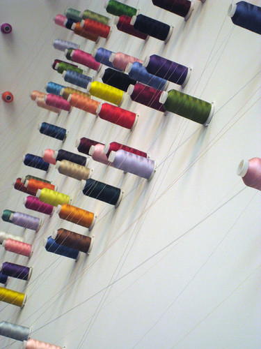
Both these works are part of Re:Thinking Trade, a strand of the Touched exhibition which also includes Lee Mingwei's The Mending Project, (above), in which visitors are asked to bring items of clothing that need mending, and keep the artist company whilst he fixes them. Rather than making the repair itself invisible, instead the process of mending is celebrated and marked with multi-coloured embroidery stitches, using the brightly-coloured threads that create a web around the space, connecting children's teddy bears with items of well-loved clothing.


Meschac Gaba, The Souvenier Palace, Liverpool Biennial 2010


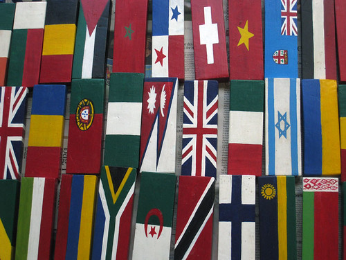
Close by, Meschac Gaba has created The Souvenir Palace (above) - a souvenir shop with a twist. Here, souvenirs are displayed alongside the accumulated detritus of everyday life, all painted in the colours of different national flags. The shop is intended to function as a trading post, so visitors to the exhibition can bring along their own personal items to be painted and swapped for those on display, in a fun riff on the commodification of national identity, and the mass production of stock souvenirs.


Liverpool Biennial Visitors Centre 2010

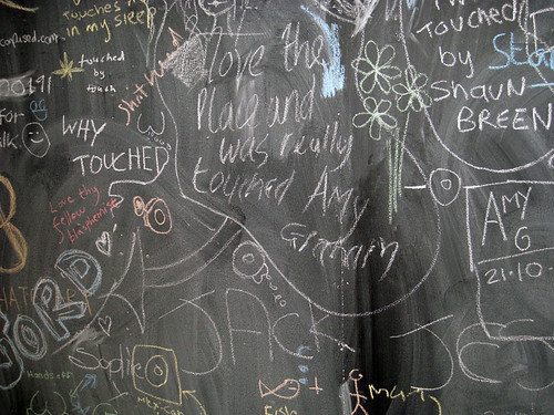
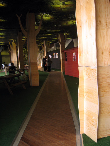
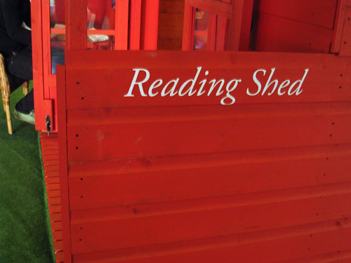
2.15pm: Also at Rapid is the Biennial Visitor's Centre (above), which transforms the disused space into a bustling faux woodland grove, dotted with sheds painted in pillar-box red (below). Blackboards provide a space for visitor feedback, as well as information about the day's events and happenings, and visitors can also explore artworks such as The Marx Lounge by Alfredo Jaar, which includes three copies of every work ever written by, or about Marx, complete with comfy sofas should you wish to peruse them.


Liverpool Biennial Visitors Centre 2010 Reading Shed

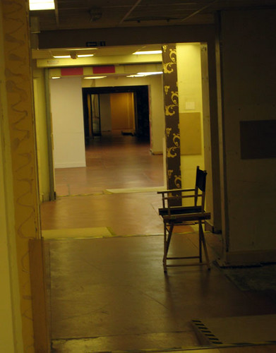
Downstairs in the basement, a labyrinth of empty, atmospheric corridors lead us to encounter Trill-Ology, a disconcerting video installation by Texan artist Ryan Trecartin, recommended to me on Twitter by @
sheshark. Here, the artist and an accompanying gaggle of shrieking, gender-bending miscreants, smeared in make-up like extras from a horror movie, perform in an extraordinarily inventive trilogy of garish video pieces - a relentless, hectic mashup of plane crashes, LA-style pool parties, soliloquies, hissy-fits and stripteases that play out like a reality TV show on acid, creating an uncanny contrast with the silent spaces of the Rapid basement.

52 Renshaw Street, Liverpool Biennial 2010


3.30pm:
After a quick pitstop for lunch (an essential item on the agenda), it's time to head onwards to the Anglican cathedral, where the Oratory is playing host to The Temple of a Thousand Bells, a installation by Brazilian artist Laura Belém, recommended to me as a highlight of the 2010 Biennial by @alistairbeech.

The chilly white space of the Oratory is the perfect venue for this ethereal installation in which glass bells are suspended invisibly from the ceiling, alongside a haunting soundtrack of music and the legend of an island temple that sinks beneath the sea.

Laura Belem, Temple of a Thousand Bells, Liverpool Biennial 2010

4.00pm: Next stop is FACT, but en route we spot a wolf (the distinctive logo for this year's Biennial, created by Carlos Amorales) and make a detour into 106 Wood Street, an empty garage that has been transformed by Raymond Pettibon into a 'mixed-media environment' incorporating the animation Sunday Night and Saturday Morning (2005), as well as wall-drawings alongside pre-existing graffiti.
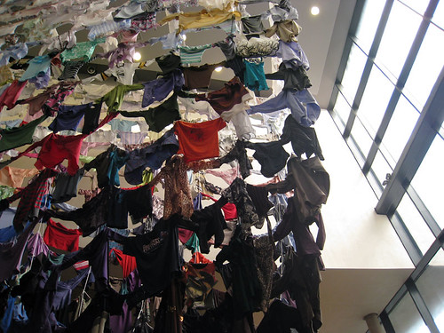
4.20pm: On to FACT, where artwork by Finnish artist Karinaa Kaikkonen has taken over the foyer space. For Hanging On to Each Other (below), Kaikkonen collected second-hand clothing from people all over Liverpool to create a colourful washing-line style installation.

Hanging On to Each Other, Kaarina Kaikkonen at FACT, Liverpool Biennial 2010

In the gallery spaces themselves, Yves Netzhammer's Dialogical Abrasion is an uncanny, alienating experience: an installation with jarring sound and lighting effects, creating a fractured and uncomfortable environment.

Meanwhile, Tehching Hsieh’s One Year Performance 1980 – 1981 (Time Clock Piece) is an incredibly intriguing recreation of the artists original performance piece, in which he took a photograph of himself every hour, on the hour, every day for a year. Although the work on display here is merely documentation of the performance itself, there is something fascinating about contemplating the thousands of images and time clock punch cards Hsieh created over the course of the year, which completely cover the walls of the gallery.

5.00pm: At the Bluecoat, where we pause in the café for much needed tea and contemplate the (empty) Bed-In, a recreation of John and Yoko’s famous 1969 peace protest, which is hosting a new action by performers, artists and others each day.

Next up are the galleries themselves, where we encounter Daniel Bozhkov's recreation of the Liverpool FC dressing rooms for his installation Music Not Good For Pigeons and Ranjani Shettar's understated installation for the Vide.

My favourite work here, however, has to be Nicholas Hlobo's Ndize, a playful installation that leads visitors through a maze of brightly coloured, densely hanging ribbons that hang from the floor to the ceiling. Part sinister funfair, part innocent game of hide-and-seek, this is a genuinely disorientating and entertaining experience - the perfect end to our Biennial odyssey.


6.00pm: It's time to head home. There's so much more I wish I'd had chance to see... Do-So Huh's
Korean House, more Touched offerings at Tate Liverpool and in the public spaces of the city, Bloomberg New Contemporaries at A Foundation, not to mention some of the many events and 'happenings' that have been taking place throughout the Biennial period... but there's only so much art you can realistically fit into one day, or in fact a mere six hours.

Final thoughts on this year's Biennial? There's an incredible range of work here, but for me, what makes it extra-special is the way we encounter it in unexpected places and spaces across the city. Perhaps that's why during the Biennial, Liverpool feels more like a playground than a conventional art gallery, full of idiosyncratic and exciting artworks to discover and engage with. Much of it is baffling, but some of it is brilliant; for me at least, the final word has to go to Adrian Searle, in his review of the Biennial for the Guardian: ‘There are things I do not understand – but sometimes this doesn’t matter.’

So did you visit this year's Biennial? What did you think of it - and what were your highlights?